Triton: Improving mission QA workflows for ATO Pros

Duration
January - March 2025
Team
Kessel Run
Role
Product Designer
Project Summary
TL:DR
ATO professionals relied on Triton for mission QA and review, but UI friction and rigid data presentation slowed down routine workflows. Important actions were difficult to find, layouts were inconsistent across environments, and wide tables forced excessive horizontal scrolling during validation.
I partnered closely with product and engineering to address these issues through two focused efforts: core UI improvements and draggable columns for data review. Together, these projects prioritized clarity, consistency, and reducing cognitive load and helping experienced users move faster without changing how they fundamentally work.
After shipping, Triton saw 50% faster mission reviews, 30% faster workflow completion, and a 25% increase in CSAT, driven by smoother interactions and reduced friction in daily tasks.
User Research
How did research uncover UI pain points and guide improvements for ATO pros?
To understand where Triton was slowing users down, I conducted user interviews, usability sessions, and design walkthroughs with ATO professionals. Rather than focusing on feature requests, these conversations centered on observing how users reviewed mission data, completed QA, and prepared outputs under time pressure.
Research revealed four consistent pain points:
Low feature discoverability
New and important functionality was difficult to find and often buried in secondary menus, forcing users to rely on tribal knowledge.
Tedious document selection
Download workflows required users to manually deselect multiple file types one by one, adding unnecessary friction to routine tasks.
Slow QA due to horizontal scrolling
Fixed table layouts pushed critical data out of view, forcing excessive horizontal scrolling during validation.
Inconsistent layouts across environments
Differences in screen size and KRADOS configurations caused layout issues that made navigation and readability unpredictable.
Project 1
Core UI Improvements
ATO professionals perform repetitive, high-stakes QA tasks where speed and accuracy matter. Small interface inefficiencies like hidden actions, inconsistent layouts, unnecessary scrolling added up to significant time loss and frustration.
The goal of this project was to remove friction from these moments by improving discoverability, consistency, and efficiency across Triton’s core UI surfaces.
Design Exploration and Collaboration
I worked closely with product to prioritize which UI issues most directly impacted daily workflows, and partnered with engineering to understand layout constraints across different deployments and screen sizes.
Early design exploration focused on:
Simplifying navigation patterns without introducing new learning curves
Reducing horizontal scrolling in QA-heavy views
Ensuring layouts behaved predictably across environments
Design reviews with engineering helped validate feasibility early and avoid solutions that would introduce performance or maintenance risk.
The Design Solution
The final UI updates focused on improving clarity without disrupting existing workflows.
Key changes included:
Improved feature accessibility
Important links such as new feature updates and version information were moved to the footer, making them consistently visible without competing with primary task flows.

New Features Bar
Refined document selection
Download workflows were streamlined by adding “Select All” and “Clear All” actions. Based on user testing, document types were defaulted to selected, allowing users to opt out rather than manually checking each box.

Download Modal Before

Download Modal After
Adaptive layout improvements
Layout adjustments prevented title wrapping, simplified button designs, and improved responsiveness across screen sizes, resulting in a more consistent and readable experience.
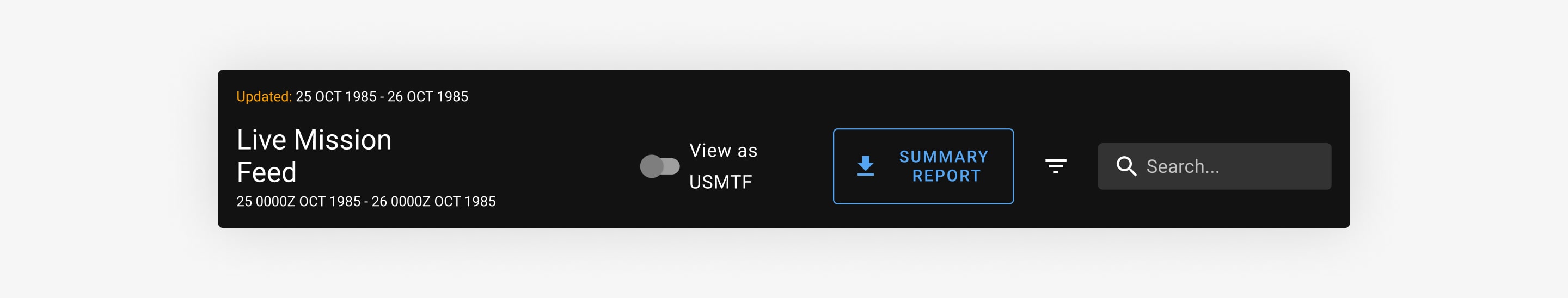
Triton Header Before

Triton Header After
These changes reduced visual noise, improved muscle memory, and made common actions easier to find and complete.
User Validation
Follow-up sessions with ATO professionals confirmed that these changes reduced friction during routine tasks. Users noted faster navigation, fewer missed actions, and less effort spent managing the interface instead of reviewing data.
Project 2
Draggable Columns for Data Review
QA workflows required users to review wide tables containing many fields. Because column order was fixed, critical information was often pushed far out of view, forcing users to scroll horizontally or export data to reorganize it elsewhere.
Users consistently asked for more control over how data was presented during reviews.
Design Exploration and Trade-offs
One early direction explored placing column configuration controls inside the existing filters side drawer. While this centralized customization, it introduced trade-offs:
Required additional development effort to support a new configuration surface
Made column controls harder to discover during active QA workflows
Pulled users away from the data they were actively reviewing
User testing confirmed these concerns. Participants struggled to find column configuration when it was nested under filters and described it as “out of the way” when they needed quick adjustments.
These insights shifted the design direction toward keeping customization closer to the data itself.
The Design Solution
The final solution enabled direct drag-and-drop column reordering within the data table. This leveraged an existing interaction pattern users were already familiar with, since column headers were already used for sorting.
I worked closely with engineering to ensure the solution was performant with large datasets. While backend persistence was not available, we aligned on using cookies to store user preferences locally, allowing column order to persist across sessions without added system complexity.
This approach reduced navigation, improved discoverability, and allowed users to tailor tables to their specific review context without breaking focus.
Draggable Columns
User Validation
ATO professionals responded strongly during usability testing. Users noted that being able to reorganize columns eliminated unnecessary scrolling and made QA faster and less mentally taxing. Several described the experience as finally feeling “built for how we review data.”
Design Handoff
Throughout implementation, I stayed closely involved with engineering to ensure designs translated accurately into production. In addition to daily standups, we held regular syncs to review interaction details, validate copy, and walk through edge cases together.
For more complex workflows like document selection and configurable columns, I collaborated with engineers early to confirm feasibility and adjust designs based on technical constraints. This helped reduce rework and ensured the final implementation aligned with both user needs and system realities.
Business Impact
The combined UI improvements and table customization delivered measurable gains:
50% faster mission reviews
Streamlined table interactions and configurable columns reduced review time by approximately 50%.
30% faster workflow completion
Simplified navigation and reduced friction led to faster completion of routine QA tasks.
25% increase in CSAT
Improved usability and reduced frustration contributed to a significant boost in user satisfaction.
Together, these changes helped Triton better support experienced ATO professionals and reduced cognitive load during time-sensitive workflows.
Final Thoughts
This work wasn’t about adding new features, it was about removing friction from workflows users rely on every day.
Research showed that small UI inefficiencies were compounding into meaningful time loss and frustration. By working closely with product and engineering, we focused on simplifying the system, improving clarity, and giving users more control where it mattered most.
Seeing ATO professionals move faster and with more confidence reinforced that thoughtful collaboration and restraint often lead to the most impactful design outcomes.